Norrland Atlas
Concept — self-initiatedAn identity and companion app for a trail-mapping service, built from the contour line up.
Context & challenge
Context
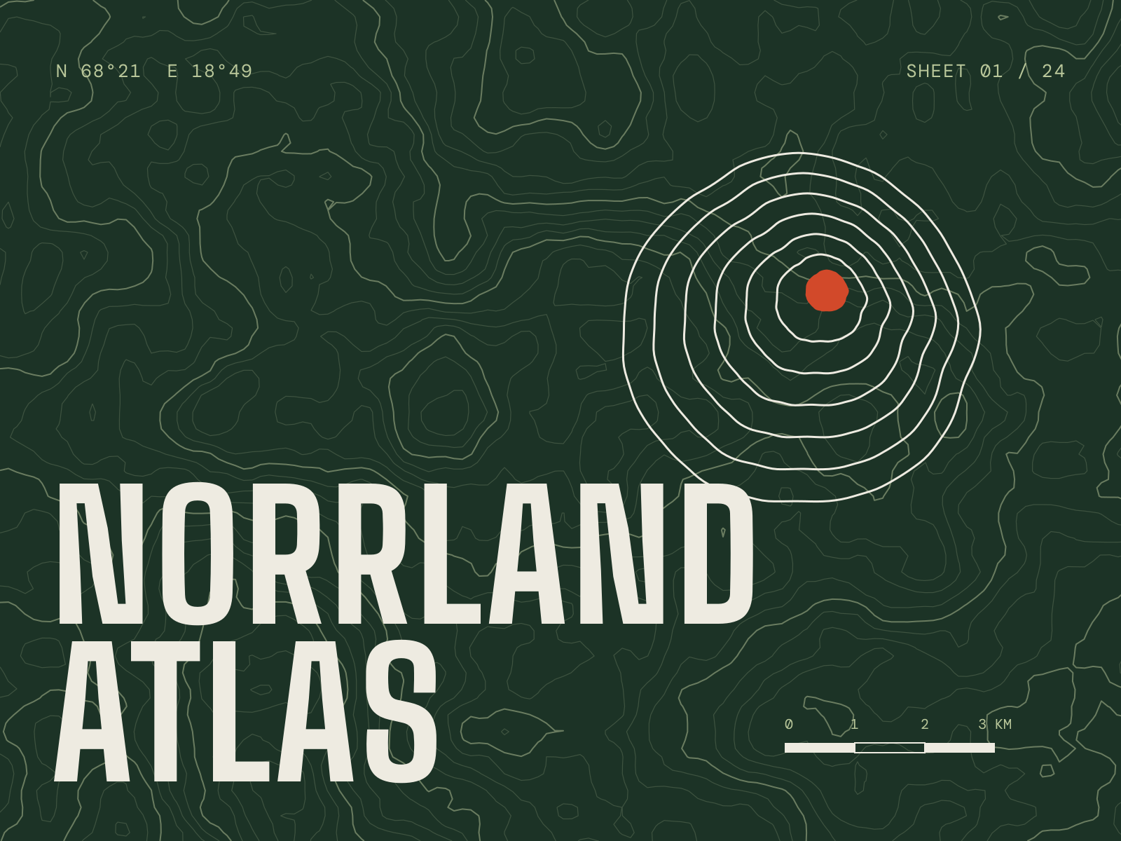
Norrland Atlas is a concept: a fictional mapping service for long-distance hikers in northern Scandinavia, with paper sheets, trail markers and a phone app that works offline.
Challenge
Outdoor brands tend to reach for the same imagery — mountains, sunsets, a compass rose. I wanted an identity that felt as precise and trustworthy as the maps people rely on in bad weather.
The app had to stay legible with cold hands, wet screens and a dying battery.
Creative direction & rationale
Direction
Everything starts from the contour line. The symbol is a stack of hand-irregular contours — a summit seen from above — with the peak marked in trail red. The same red marks routes, warnings and the current position, and nothing else.
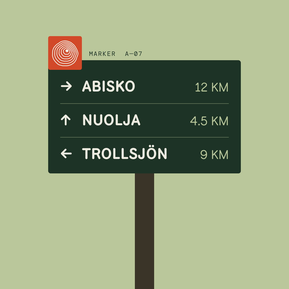
The wordmark is set in a tall, condensed sans so it fits on narrow trail posts and map spines. Signage and interface text use a face designed for park wayfinding.
Rationale
Restricting red to “you are here” and “take care” gives it meaning on the trail. The rest of the palette comes from the landscape it maps: spruce, lichen and paper.
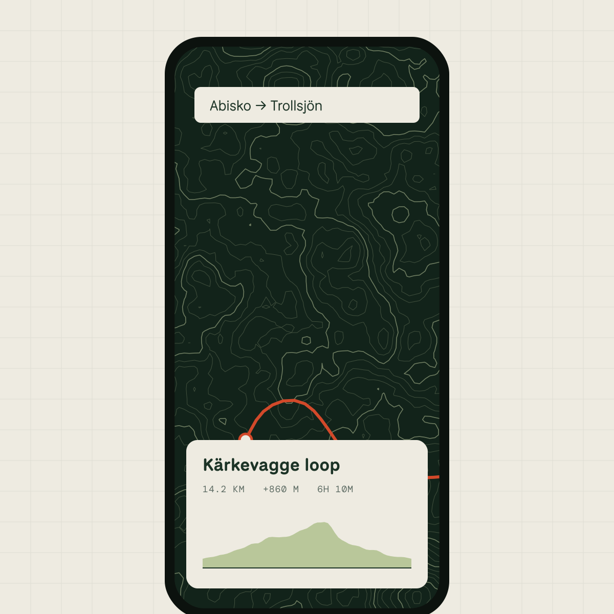
In the app, large type and high-contrast cards sit over a quiet map, so the next instruction is always readable at arm’s length.
Visual identity
Symbol / wordmark / colour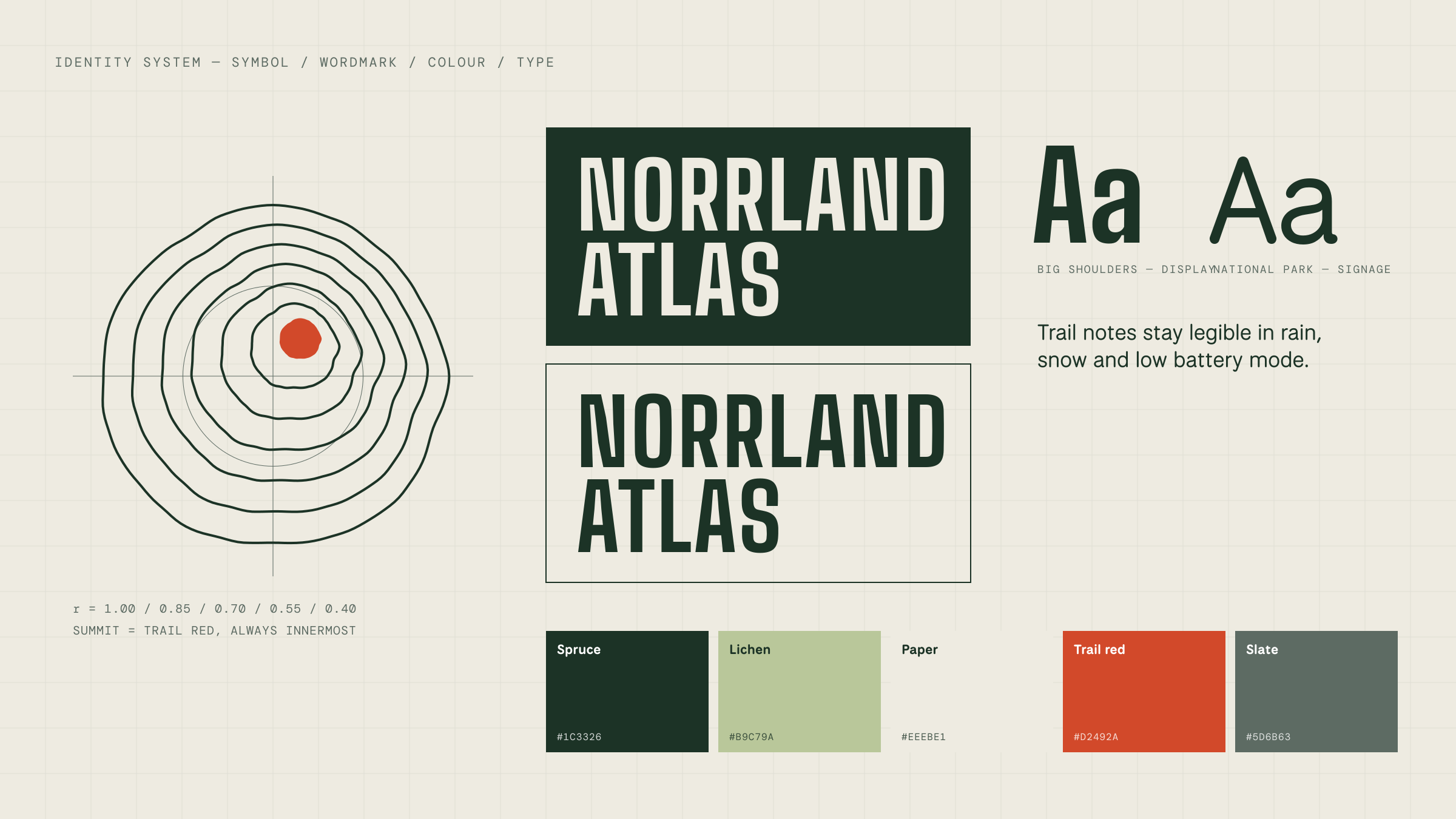
Palette
- Spruce#1C3326
- Lichen#B9C79A
- Paper#EEEBE1
- Trail red#D2492A
- Slate#5D6B63
Trail red is reserved for position and warnings.
Digital execution
App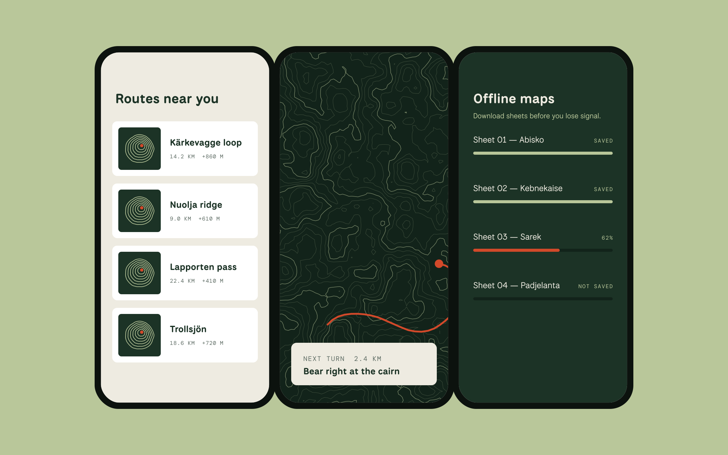
Designed for the trail, not the desk
Offline download is a first-class screen rather than a setting, because losing signal is normal in the places this app is used.
Distances and climbs use a monospaced face so numbers line up and can be compared at a glance.
Deliverables
Concept — no client results to report- Contour symbol and condensed wordmark
- Colour and type system
- Trail-marker and signage system
- App screens: route list, navigation, offline maps
Next project 02/03
Back to all work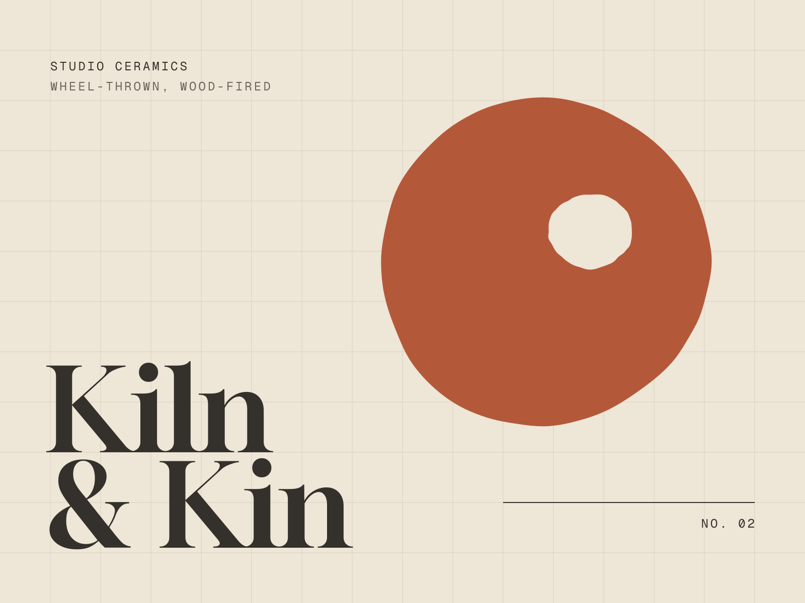
Brand identity, Packaging, E-commerce
A warm, exacting identity and online shop for a two-person ceramics studio.
View case study: Kiln & KinContact
Got something that needs character?
Tell me what you’re making and where it needs to go — a new identity, a website, or both. Email is the quickest way to reach me.
wajuogunde@gmail.com